About the
project
As the company began to penetrate new markets and scale operations, the company needed to move customers from a sales-led onboarding experience to a product-driven self-serve onboarding experience.
Having looked at the flow through a product lens for the first time, we had the opportunity to gain a holistic view of the customer experience, and then redesign it for improved conversions and connected accounts.
Challenge
The company had been in the business of Ad operations for over 10 years. Over the years, the product team build SOPs that were followed by Ad executives that involved manually collecting data for multiple sources and creating reports for their clients. As the company scaled, the overhead of manual process increased, and the company made a decision to automate reporting and created a self-serve platform so that the Ad executive could focus on lucrative tasks.
The Company also wanted to automate other tasks in their operations, to give their clients a cutting edge experience enabling them to take their revenue to the next level.
Process
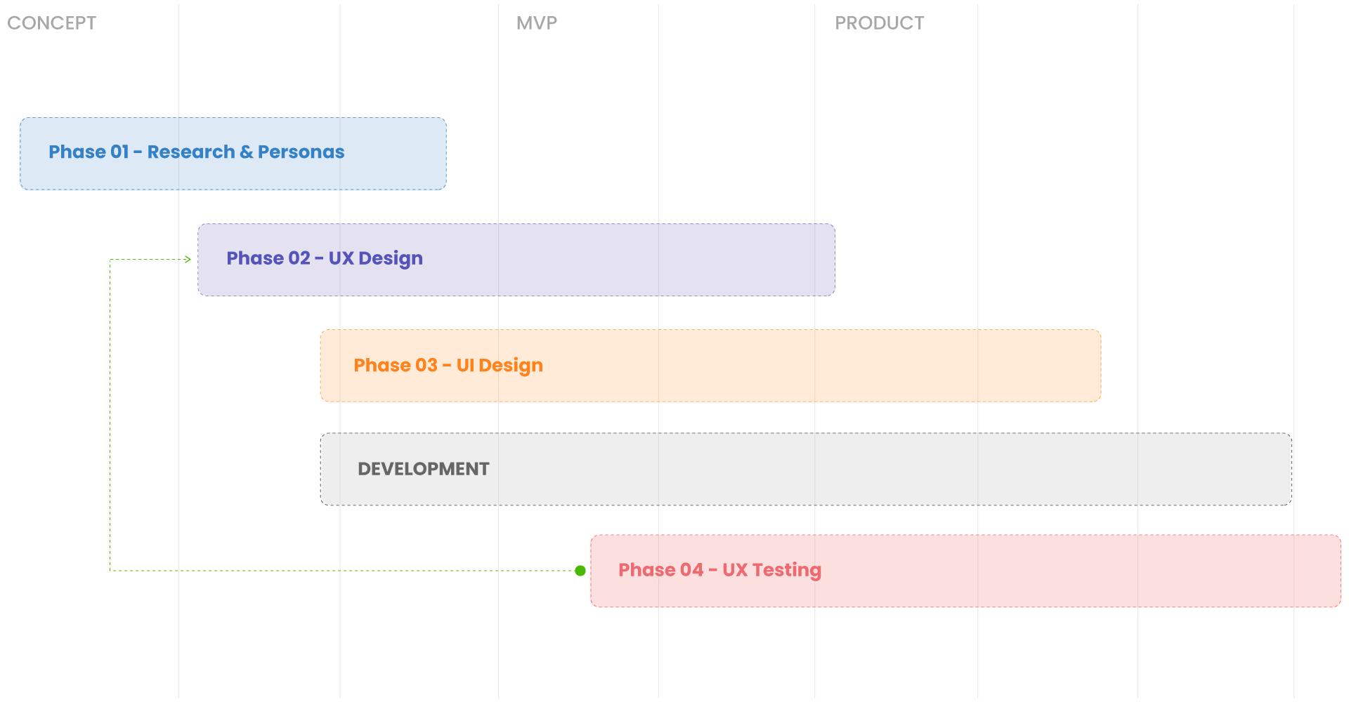
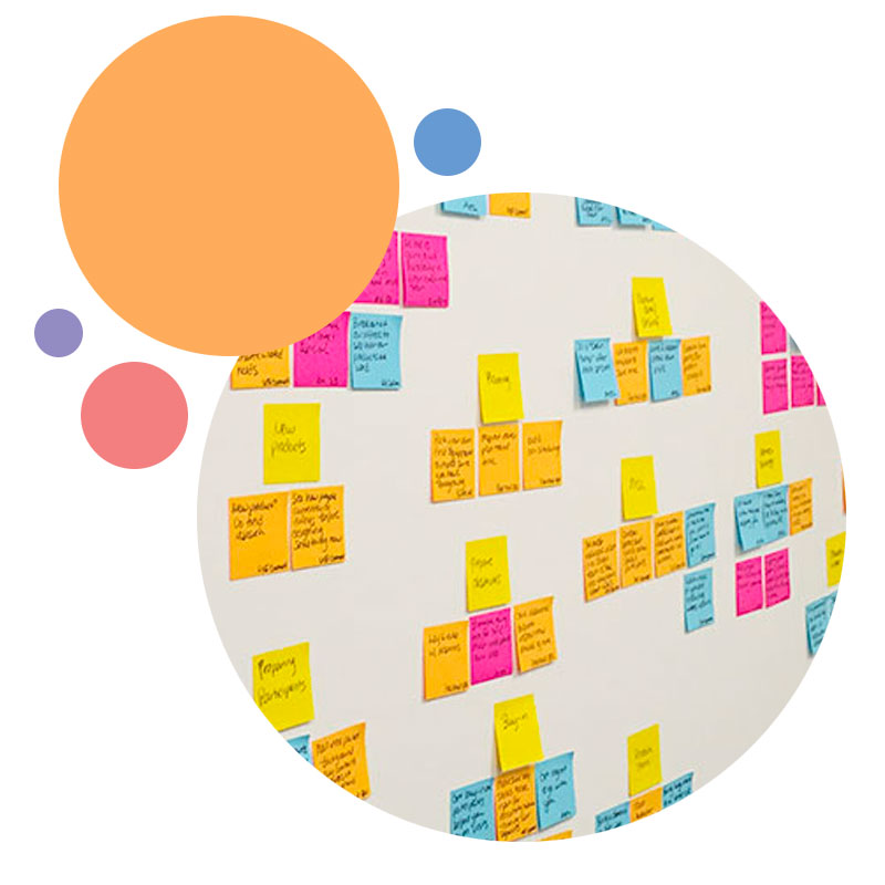
Building the platform was a big challenge for the company since it already had a large number of users and multiple datasets. To make sure that we set out in the right direction, the team joined a scoping session, where they discussed solutions to the existing problems and drafted the scope of the project.
The first phase was to understand the users of the product better and create different personas of prospective users. In the discovery phase, we spoke to some of the existing clients to understand their pain points with the existing product/process. Later we did a study of the other products competing in the same landscape to see what features they offer, this helped me and the team map out what features would be required in MVP and see which feature would give us a competitive advantage.
Personas
To build empathy with the targeted users, I decided to create an animated video and float it around with all the teams in the company. This helped all the teams in the company understand their target users and was key in facilitating product discussions.
Tom
Paul
User Flow
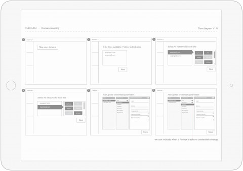
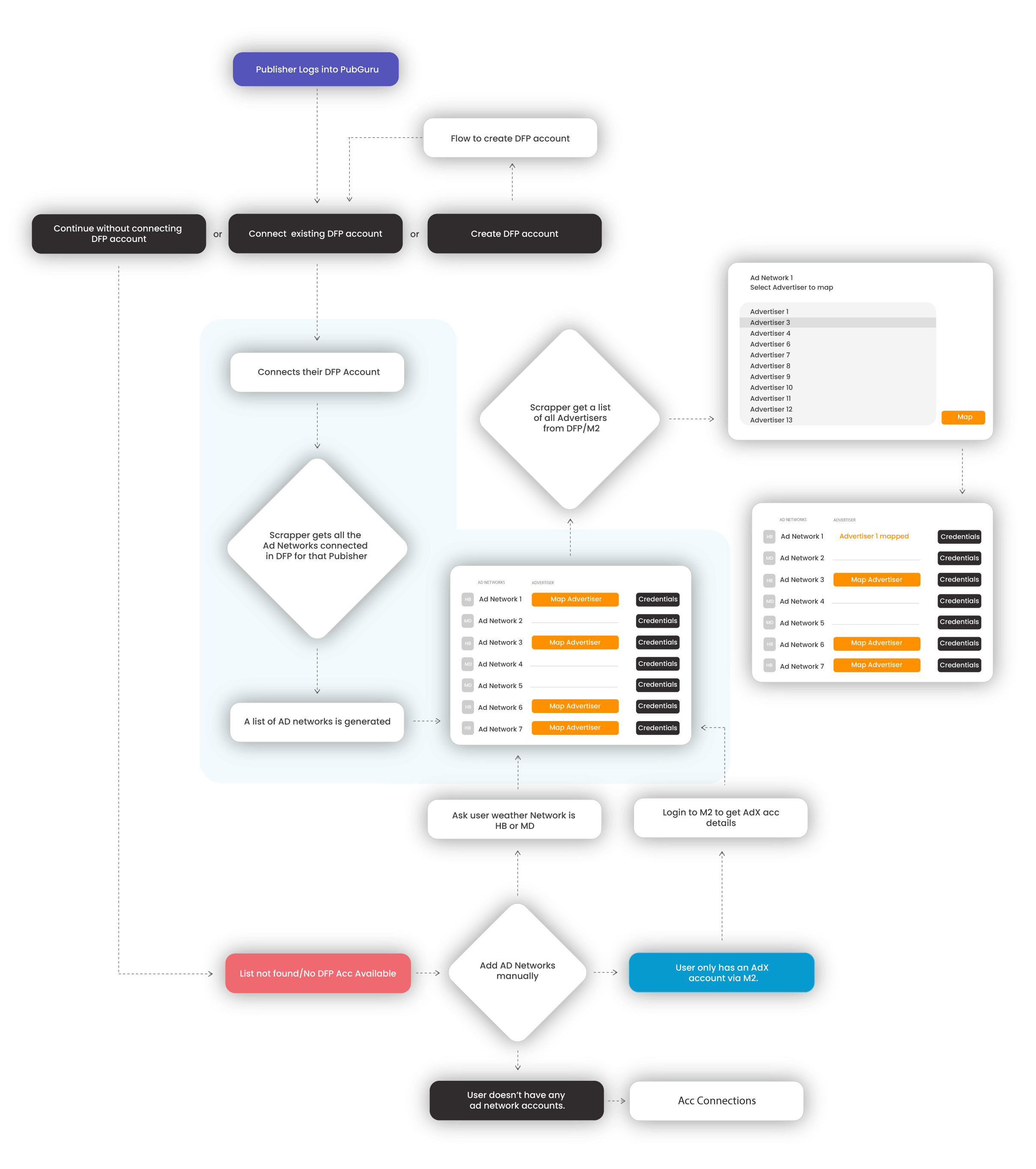
User Flow diagrams are handy for understanding the system in detail. They help the team, especially non-technical stakeholders, understand the limitations of the system, thus enables better product discussions and helps to decide a feature list, especially for MVP. Since the company already had some technology in place, it was important to study the existing system, and see how the system would be affected by the proposed features and interactions.
Wireframes
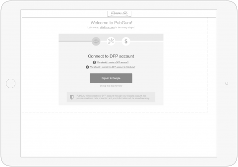
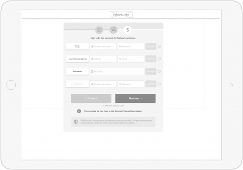
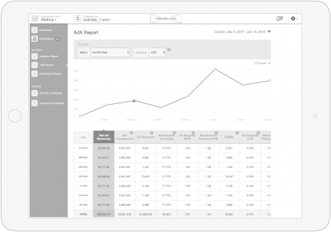
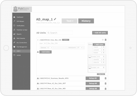
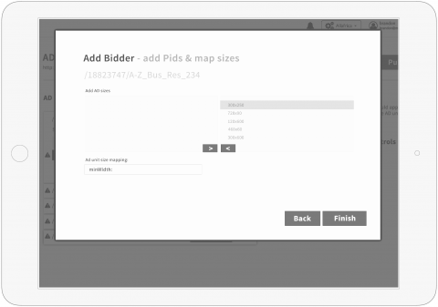
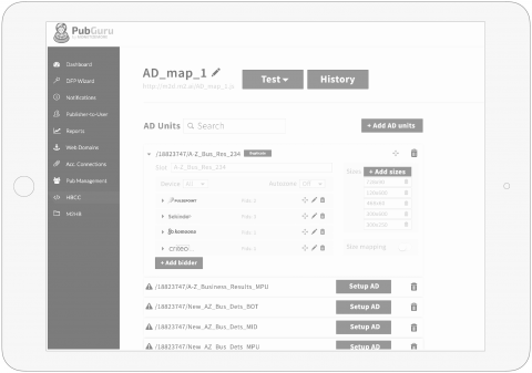
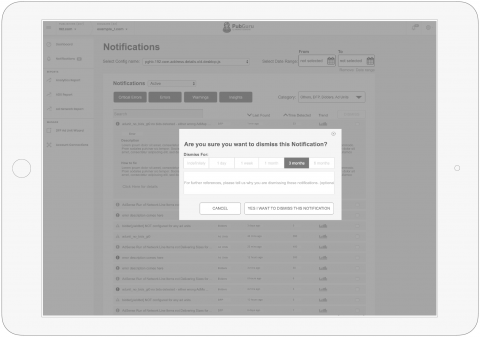
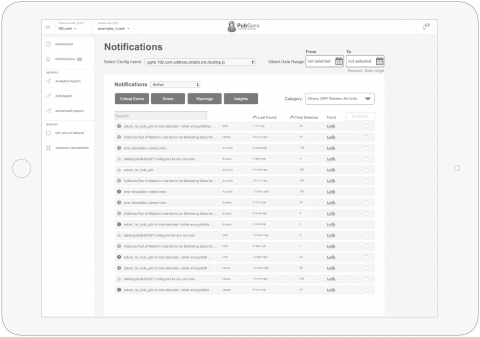
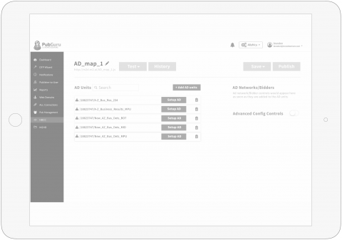
Wireframes help with testing every feature and validating a hypothesis quickly. I usually floated these prototypes first with the stakeholders in order to facilitate feature discussions. Then I did some testing with prospective users collected their feedback and kept iterating till I got a sign off from all the stakeholders involved.
Visual Design
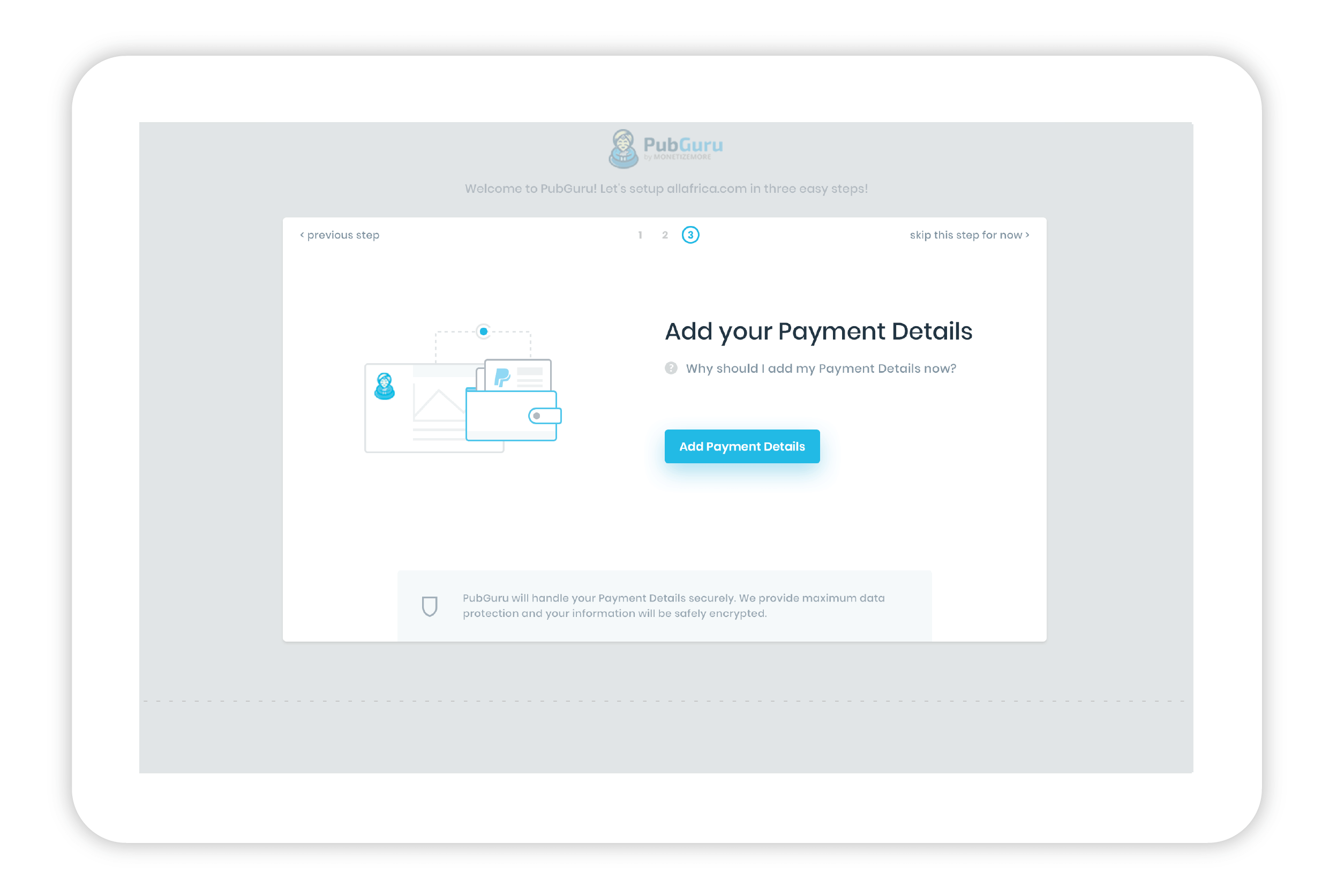
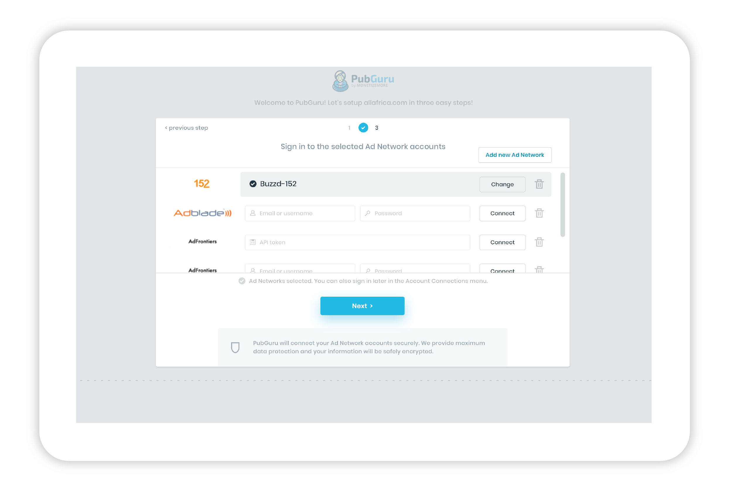
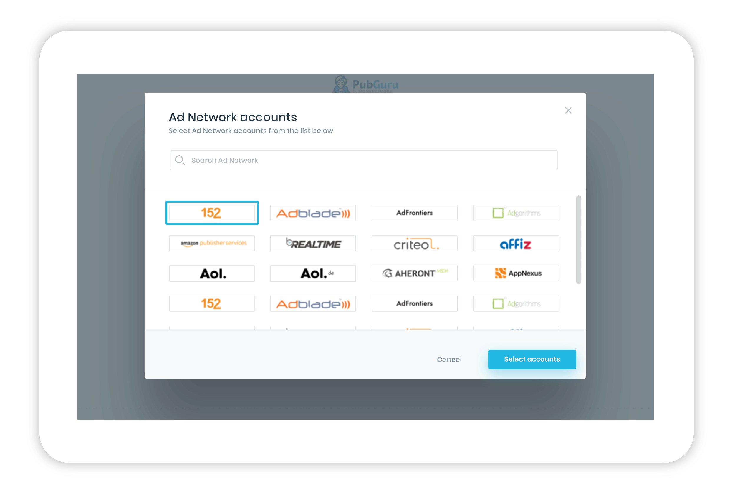
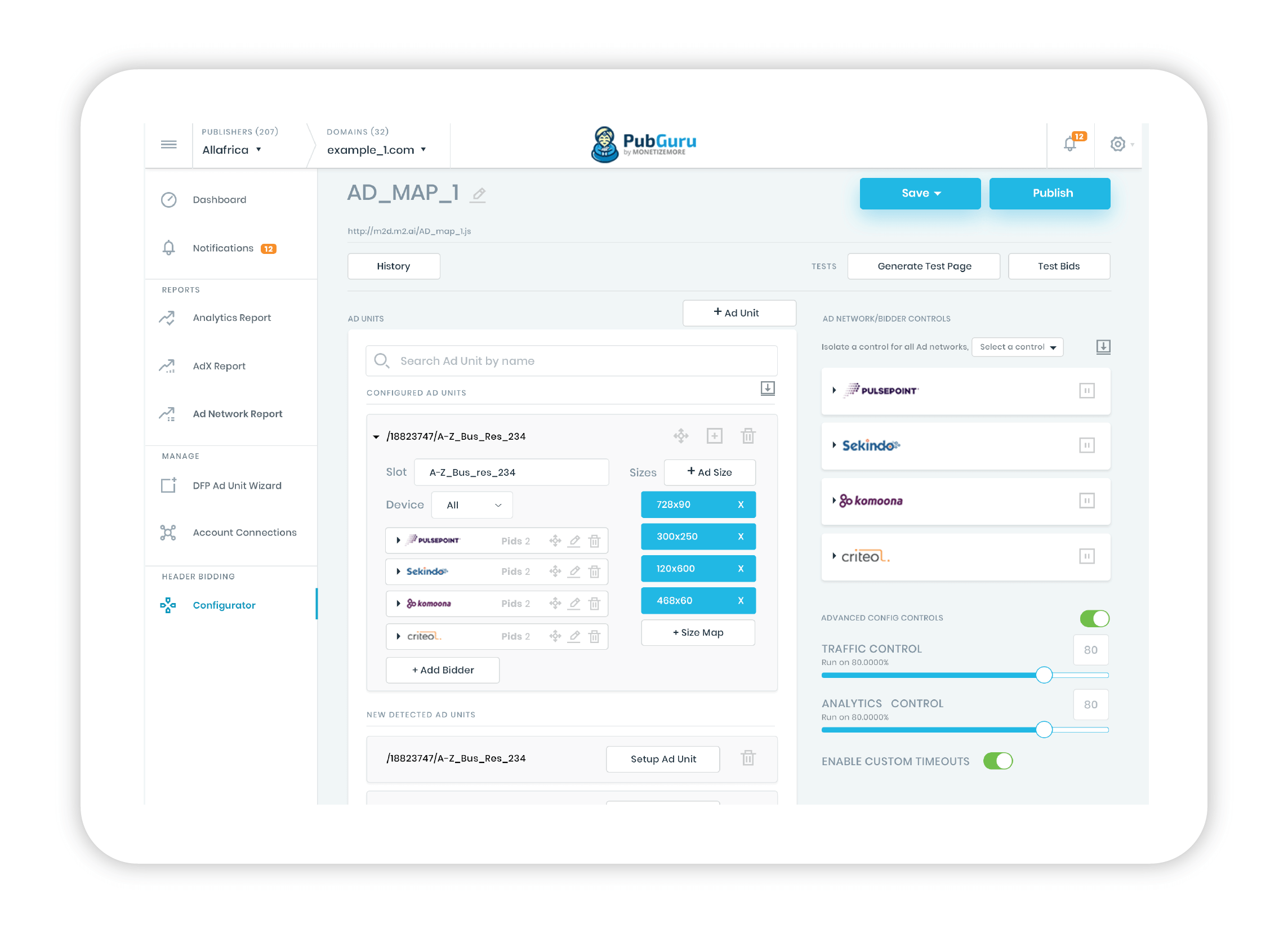
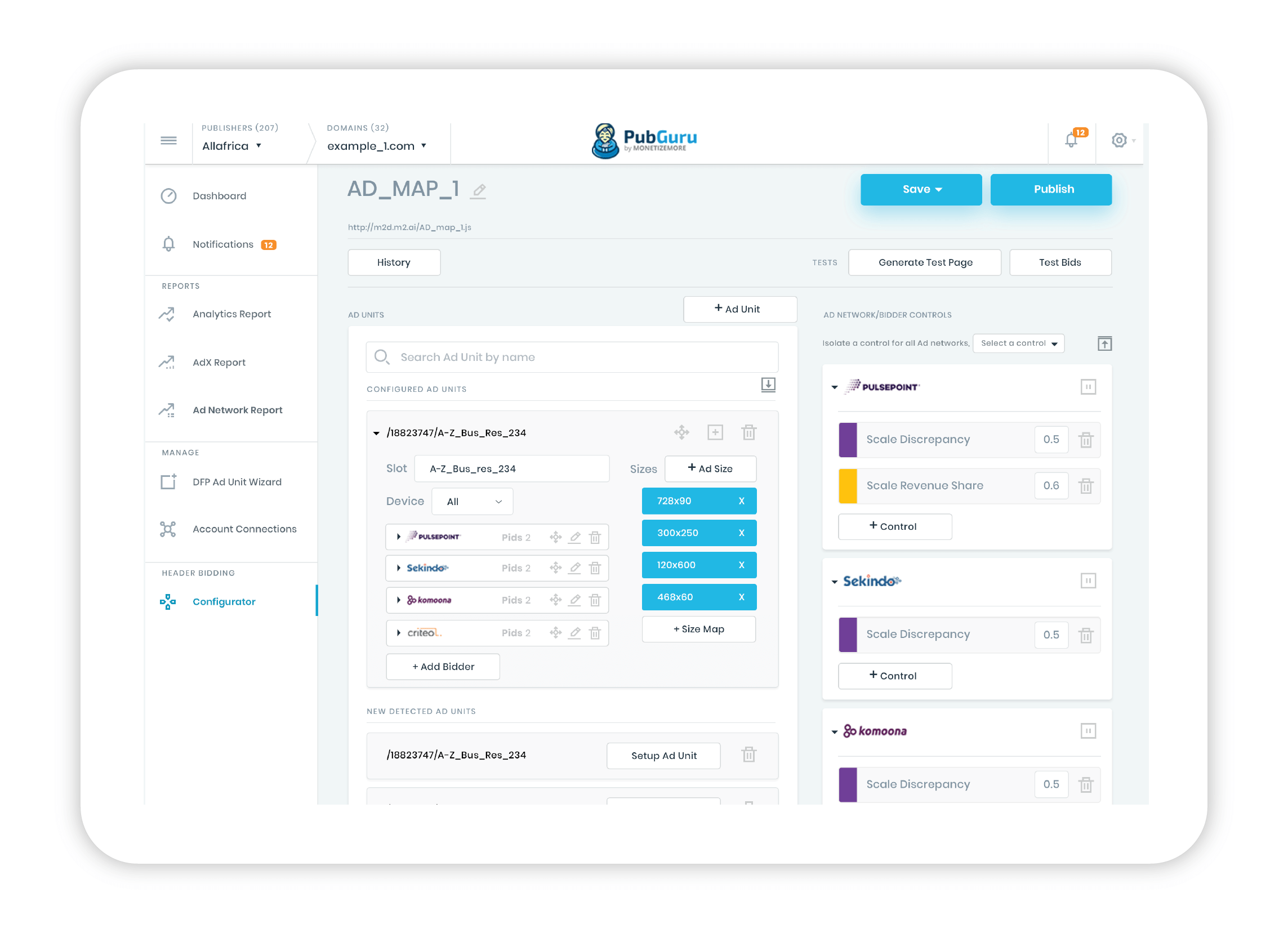
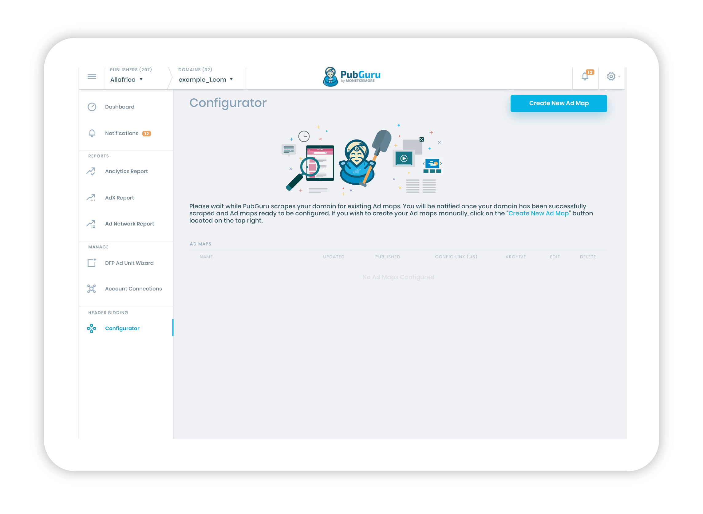
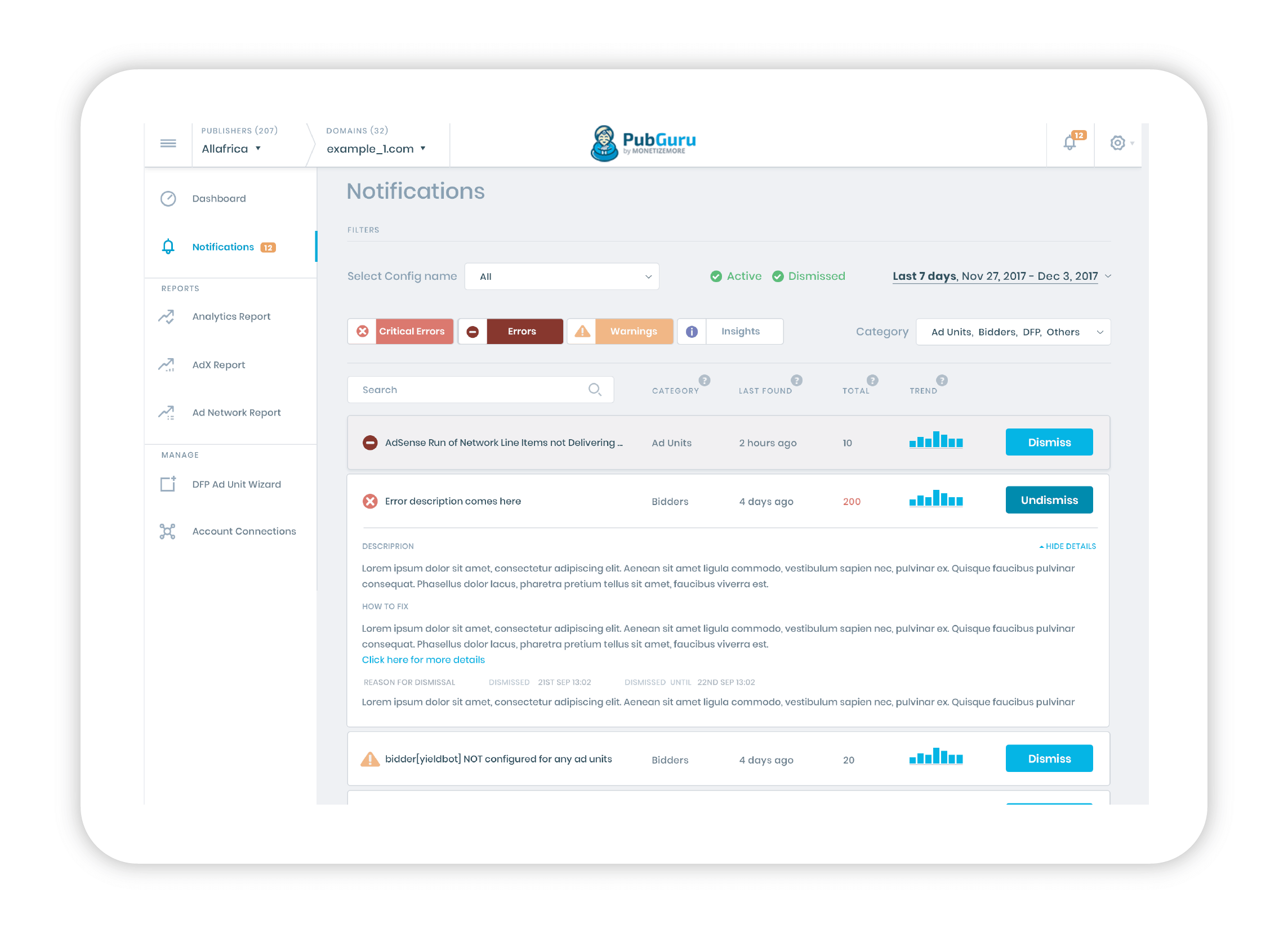
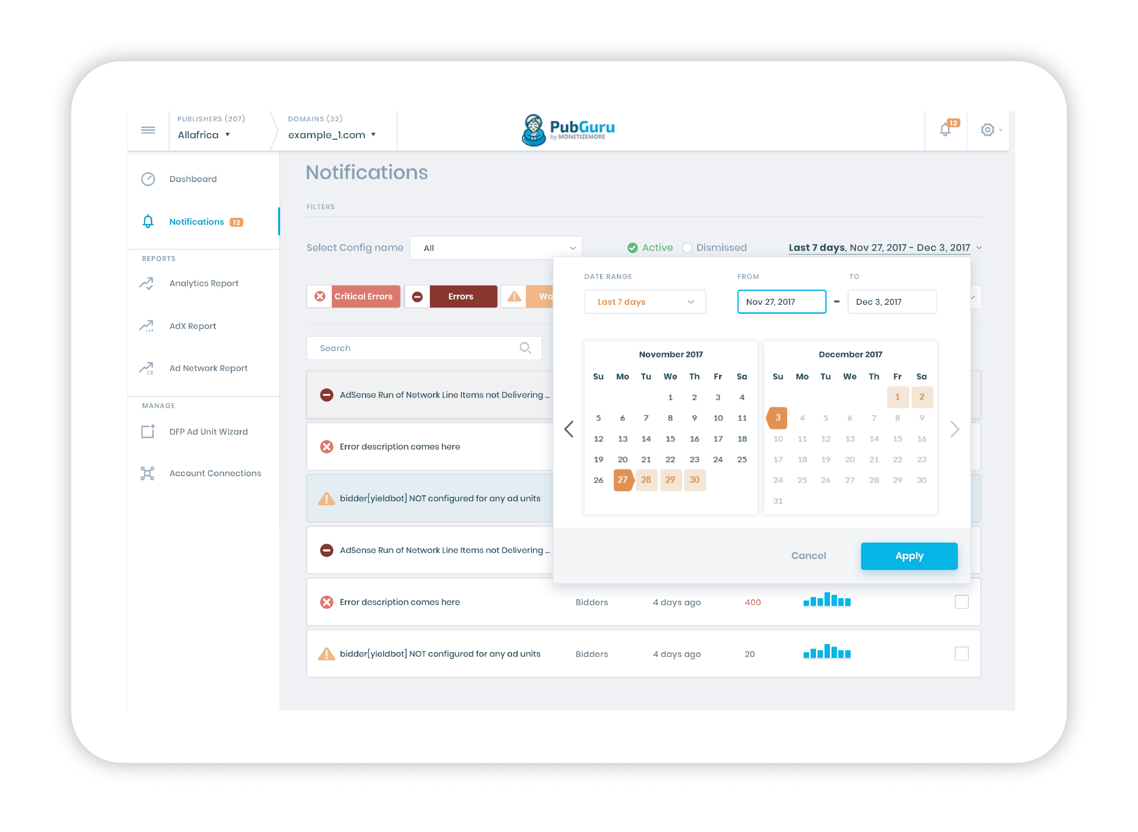
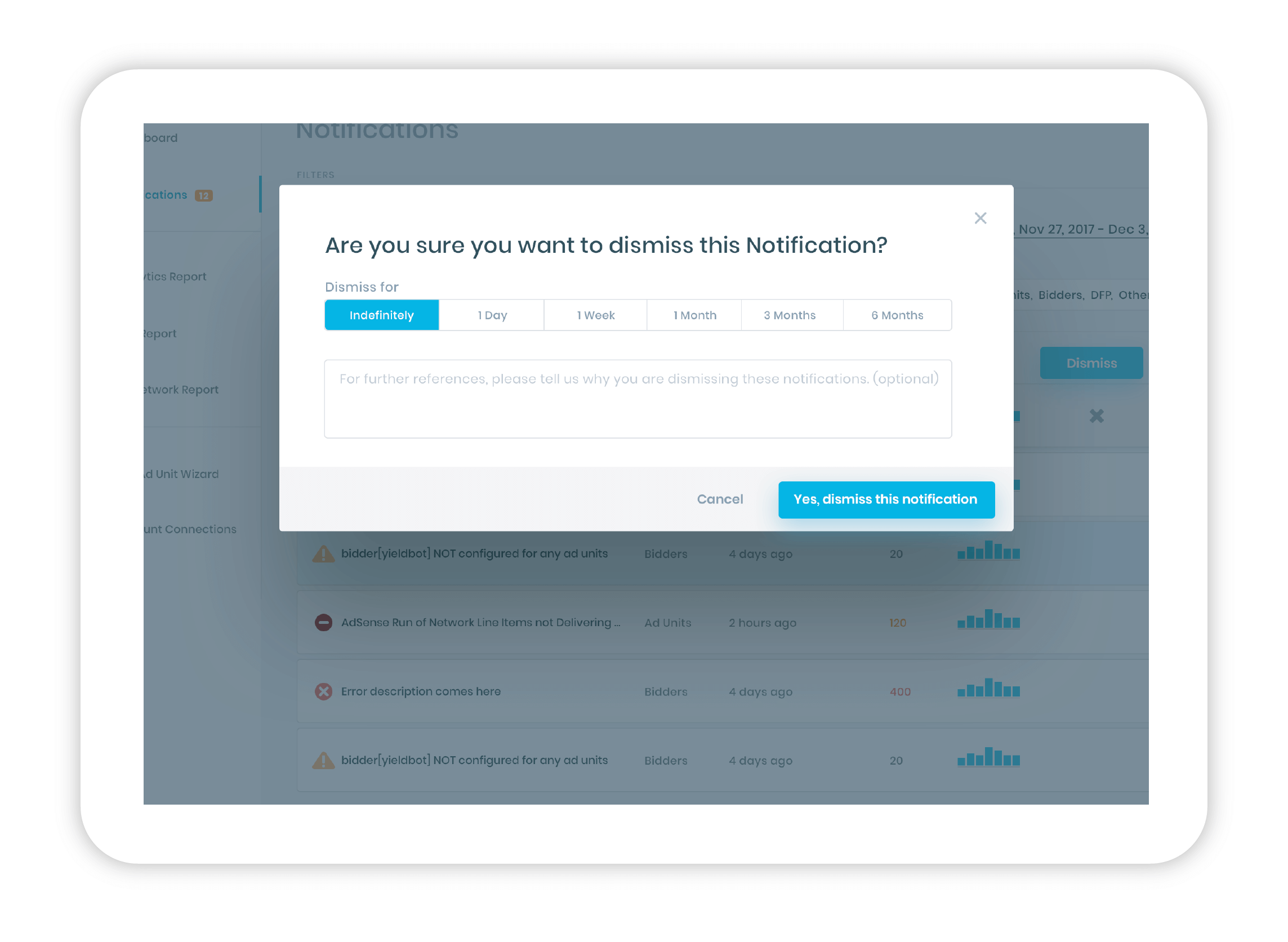
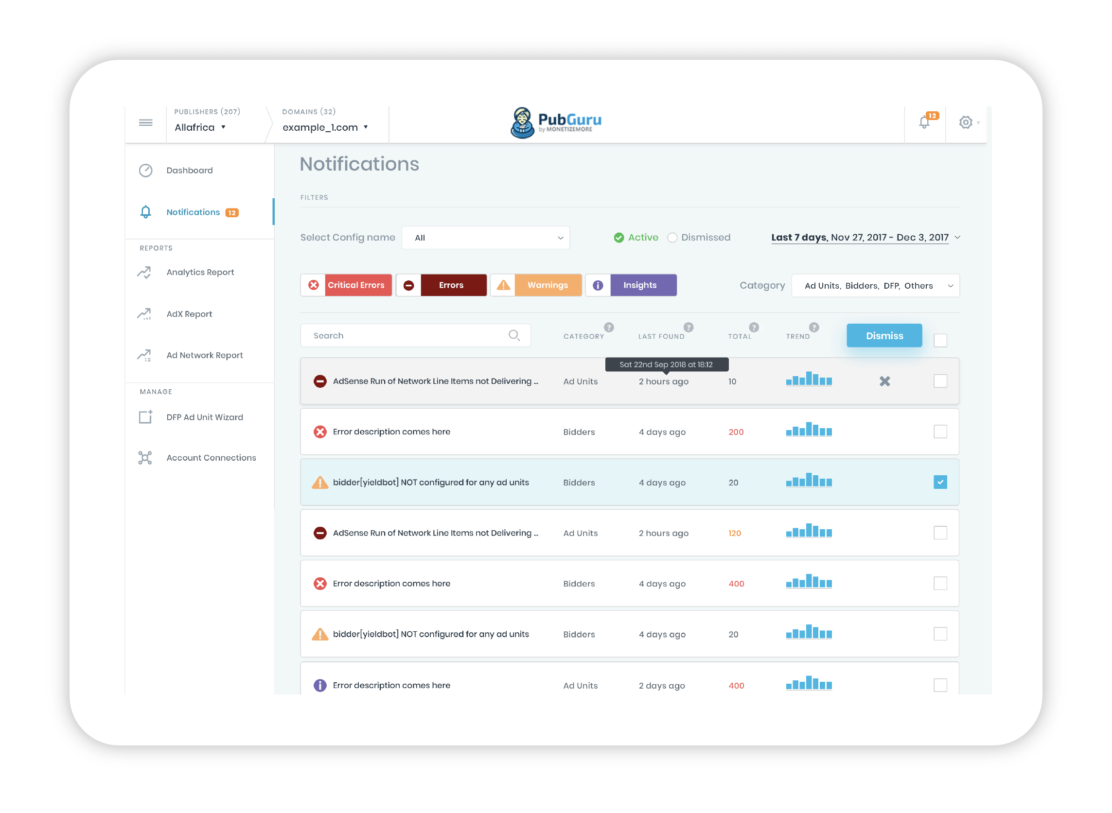
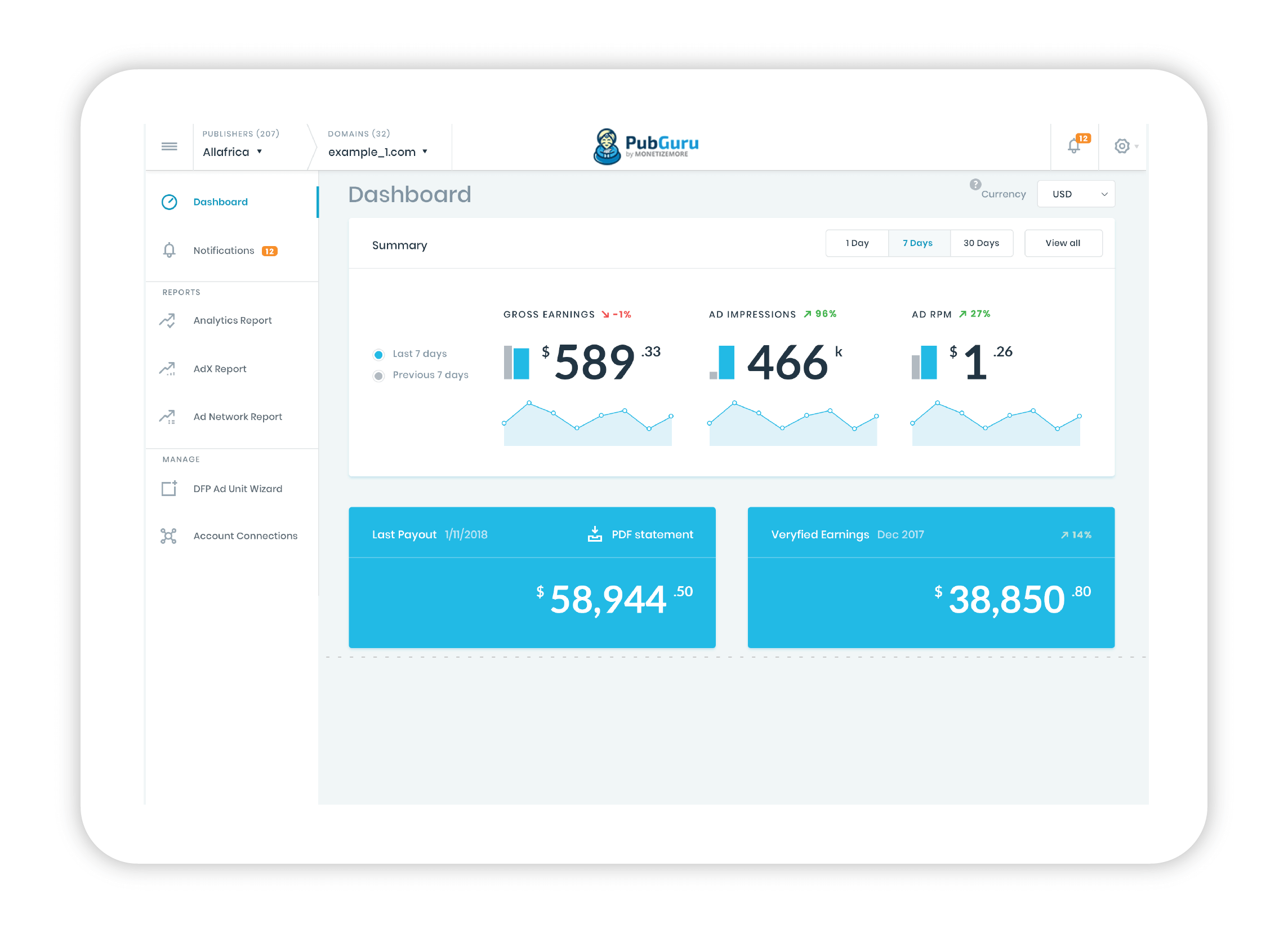
Good UI is everything, its the first impression of the entire experience hence it needs to be correctly implemented. For PubGuru I used simple, clean & focused UI. The colours used were in sync with what the brand had been using earlier. Refreshed the hues of some of the colours to ensure they look fresh and also aesthetically pleasing.
Dashboard
Understand your daily revenue performance and how your demand partners are contributing to your overall revenue.
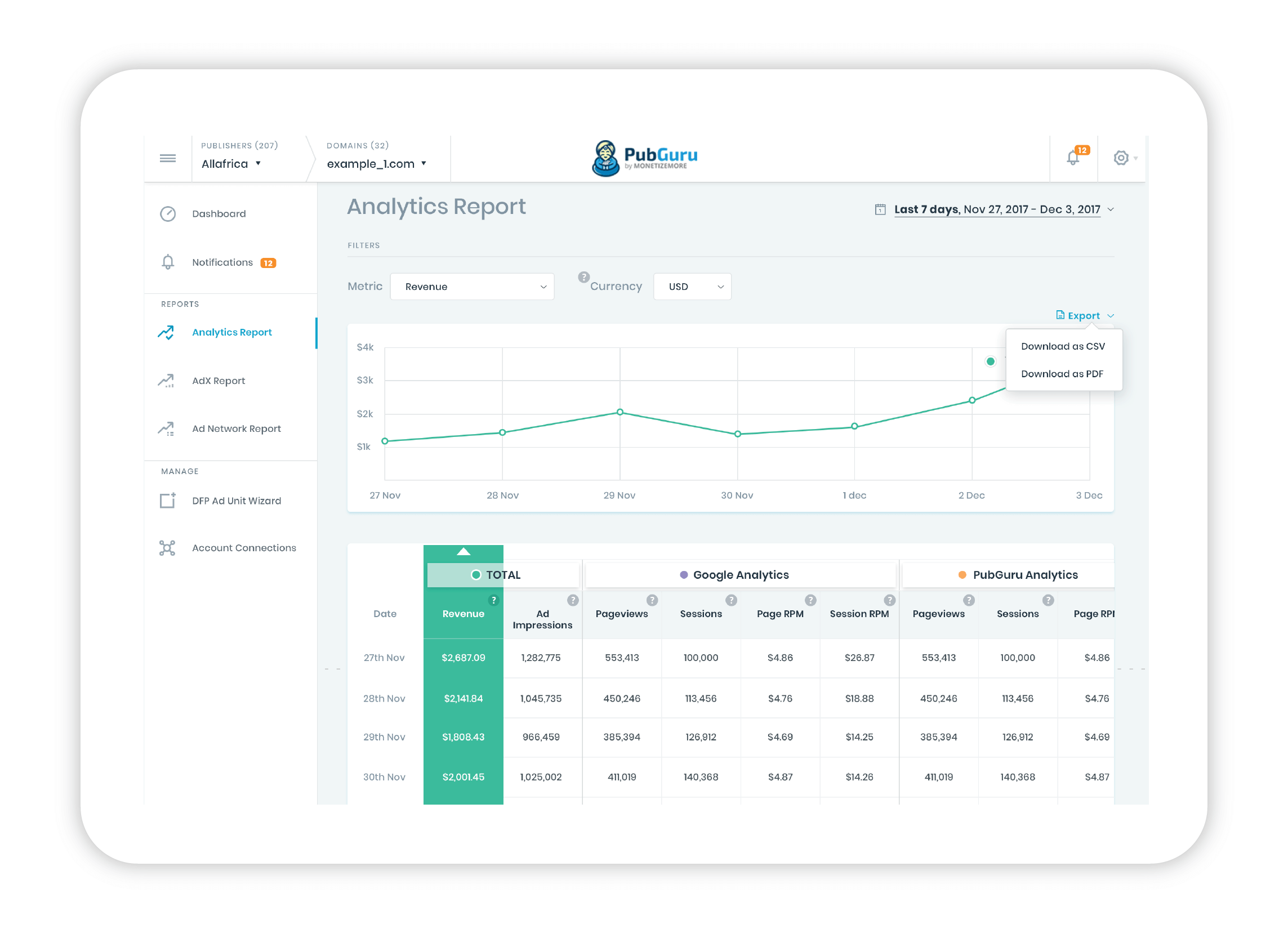
Analytics Report
Get insight into your website traffic, so you can take action to improve the experience.
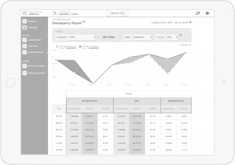
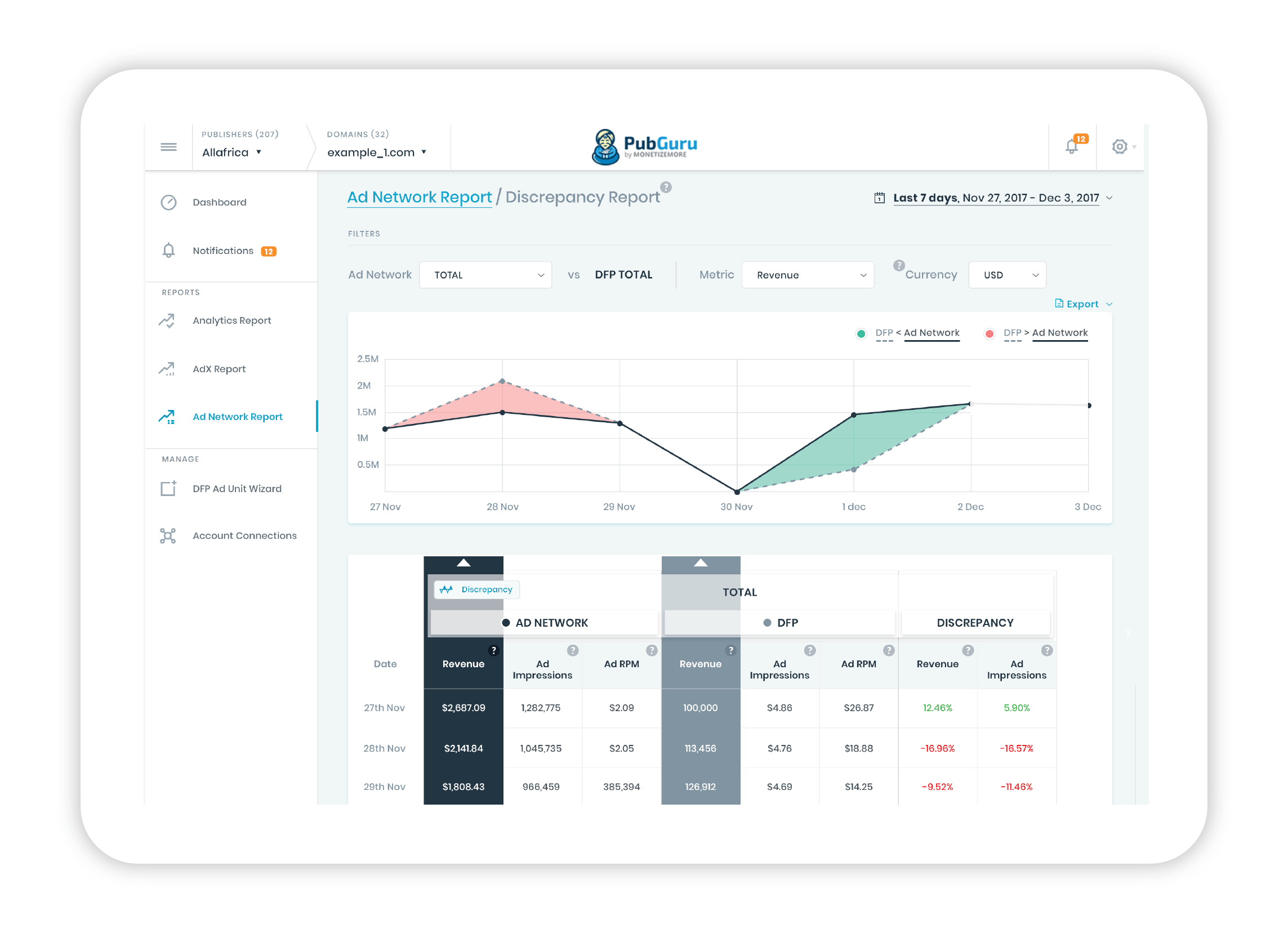
Discrepancy Reports
Drill down and compare demand partner stats against your Google Ad Manager metrics to ensure everything is running smoothly.
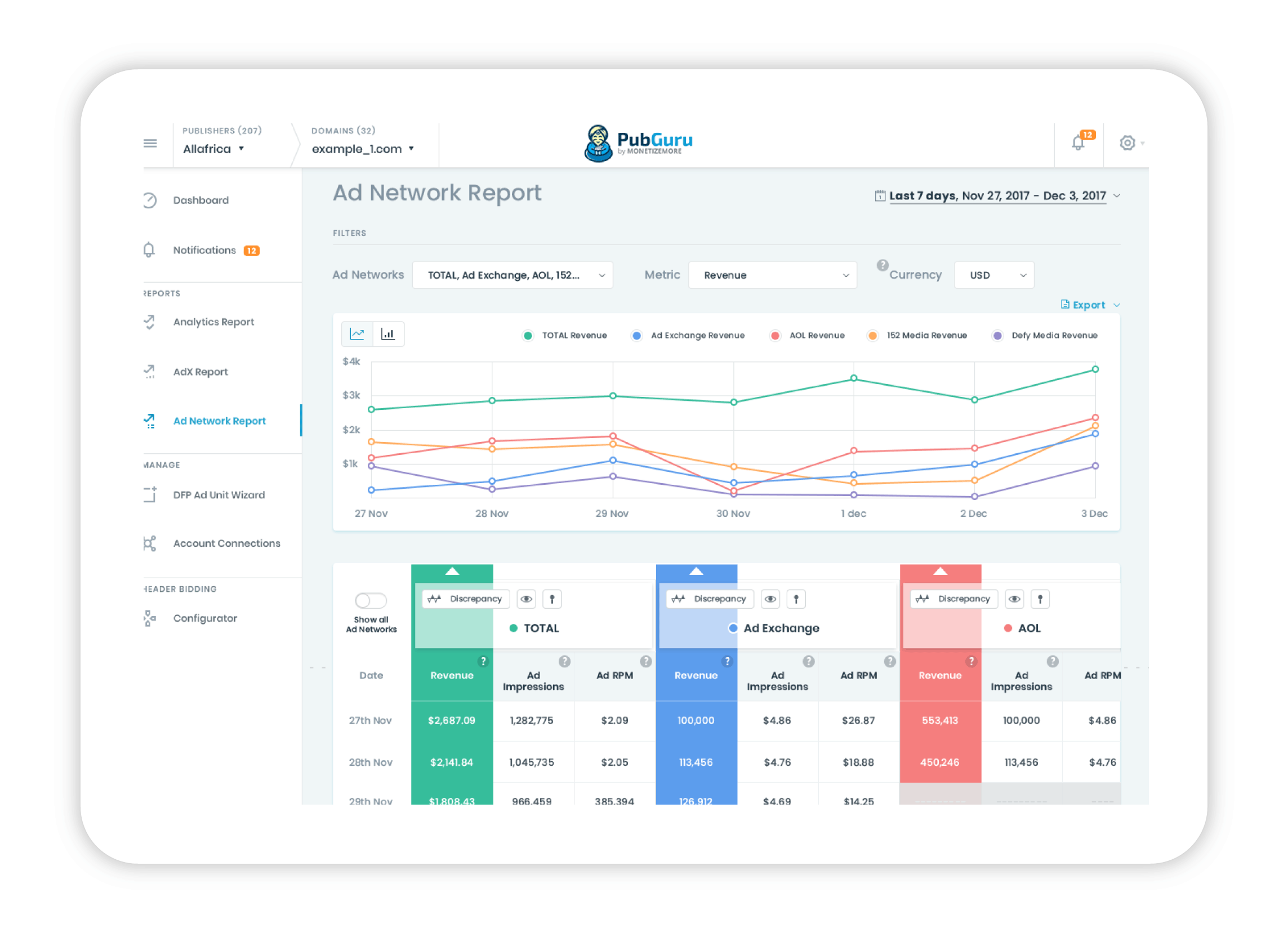
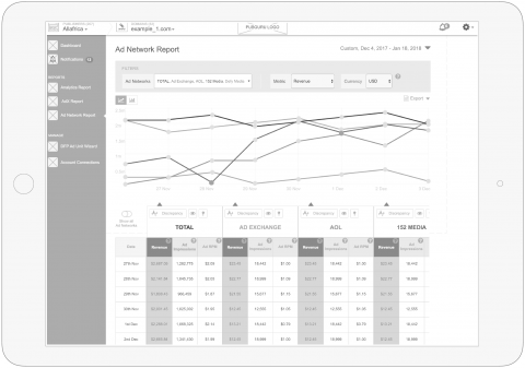
Ad Network Report
Monitor and diagnose ad revenue issues from your many different demand sources.

